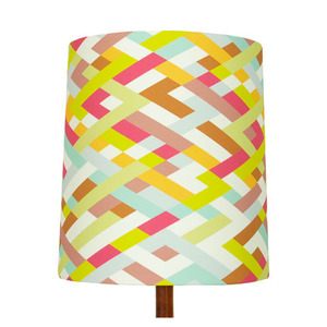
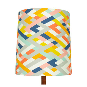
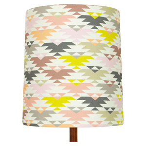
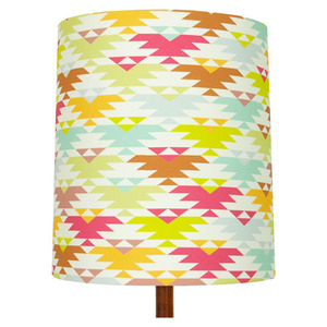
New from b/perrino

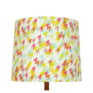
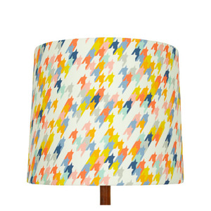
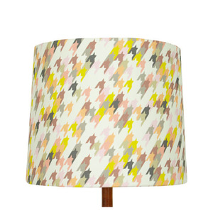
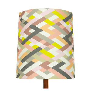
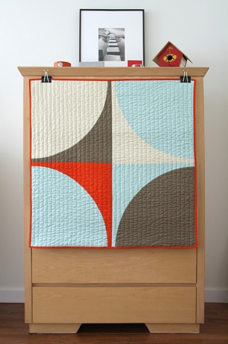
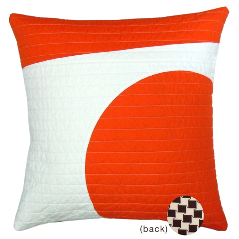
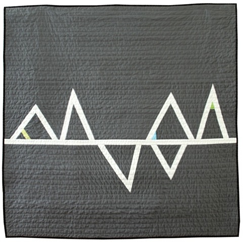
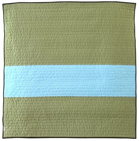
POPI've always been a fan of quilts ever since I was a kid. For one Christmas I remember the only thing I wanted was to have my mom make me a nice heavy quilt. Lucky for me she delivered, unlucky for me I picked out a black and forest green flannel. Flash forward 20 years and my mom and I are still talking about quilts. Luckily our taste has evolved and there are some amazing modern quilts out there. If you haven't seen the work of Barbara Perrino you are seriously missing out. She was nice enough to recently send some pictures of her latest work my way.  Check them out below.

b/perrino quilts

MilanoComboGreyTrianglesGreyTrianglesBack

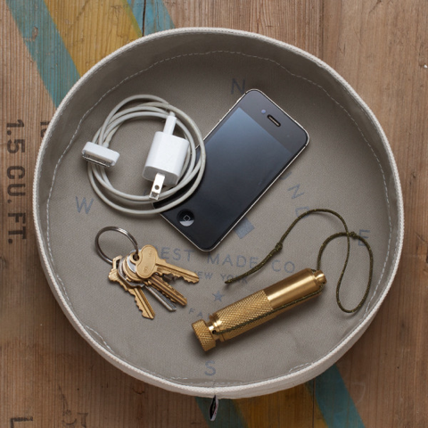
Brass Bottle Opener

modern brass bottle opener

There are a few constants in my life lately, namely I'm in love with brass, and I'm a sucker for bottle openers. Obviously I fell in love with this one.

Hand carved from wax, these brass bottle openers are left unfinished to allow a unique patina to develop over the facets and textures in each handle. The wide opening allows the head to land firmly on the top of any bottle. 

I own a few brass bottle openers (told you I'm a sucker) and one of my favorite things about them is the weight. I have a feeling this one wouldn't disappoint either. 

Bottle Opener from Fort Standard $73

brass modern bottle opener

modern brass beer bottle opener

Robert Siegel Ceramics

NewImageA few weeks ago I went to the Park City Arts Festival. For some reason arts festivals always sound exciting and interesting but inevitably end up having the exact same things I saw the year before.  Really, how many different booths do we need for wooden cutting boards made out of different types of wood?

The one shinning star that did stand out was Robert Siegel's ceramics. Sure they weren't totally original, we've seen similar designs from Pigeon Toe ceramics and others, but amongst all the other booths it was a beautiful thing to see. Make sure you check out his Kauai collection shown above as well as his standard line

All of his prices are very reasonable for a hand made product.

Robert Siegel Ceramics

NewImage

STACT modular wine rack

NewImage

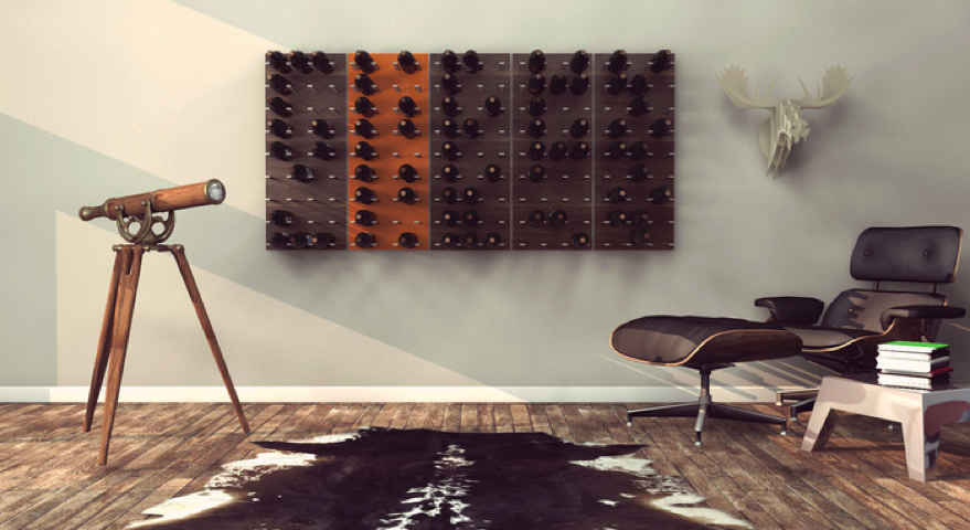
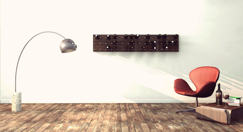
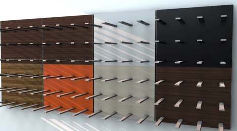
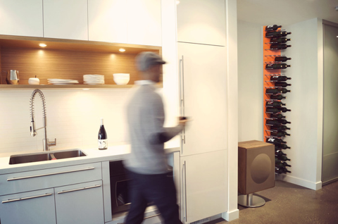
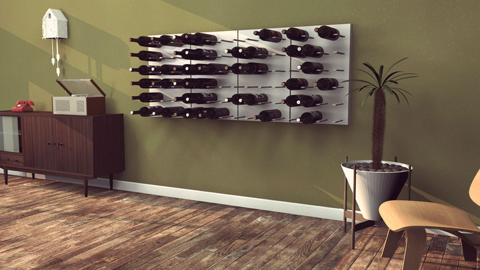
Here is a Kickstarter project that was destined for success from day one. First off it's designed by one of my favorite designers Eric Pfeiffer. Second, it holds wine, which everyone loves. Third, it looks great. The fantastic photos that accompany it don't hurt at all either. The STACT modular wine rack is made of aluminum and your choice of wood, and is a modular system that can grow and move with you. It puts your bottles on display, and equally important, close at hand. 

The Kickstarter project still has 28 days to go and has already doubled the funding it needs to get off the ground.  Mark my words folks, this is your chance to get it for a great deal. After this I bet it will still be produced but prices will go up.

STACT modular wine rack, starting at $95.

NewImage

NewImage

NewImage

NewImage

Feedly + What blogs do you follow?

NewImage

It's been a while since I have found some life changing technology. I recently upgraded to OSX Mountain Lion and ended up migrating back to a few core Apple applications (Mail, Safari). In the process I've been on the hunt for an elegant looking RSS reader so I can keep track of the few blogs I follow on a regular basis. I wanted something web based that would sync across multiple devices, and did I mention I wanted it to look good? Luckily I stumbled upon Feedly. The web based app is available on Chrome, Safari and Firefox (as well as most smartphones), and looks amazing on all of them. It works by syncing up with your Google reader account and presenting all the blogs you follow in a beautiful layout. I'm only a few days into using it but so far I'm absolutely in love. It has a robust set of shortcuts and different configurations to make it fit your needs. 

Check out Feedly now.

Get your reading list jumpstarted by importing my list of sites below to google reader by downloading this file (right click save). Update your google reader account then sync with Feedly. Instructions here for google, and here for Feedly.

So what blogs do I follow? 

Here is where I have to make a confession. For being a modern interior design blogger I'm absolutely horrible at following fellow bloggers. Part of it is that I don't want to be that guy that just re-blogs awesome things that I find on other sites, and part of it is that I'm just lazy. That being said, I would encourage everyone to check out the following blogs if you don't already. 

Plastolux

Designsponge

Design Milk

Better Living Through Design

Remodelista

Swiss Miss

I feel like that little group has been and will continue to be the core of good design blogs out there. I may have missed one or two (did I mention I'm lazy?), if I did, let me know in the comments. 


Now on to what I follow daily. It's a good mix (for me anyway) of design, fashion, and other visually interesting sites. In no particular order…

Build Blog

NewImage

Build is a Seattle based architectural firm that specializes in Modern and Mid Century modern design. What I really like about the Build Blog is that it reminds me of the good old days of "modernism" online. When I first started blogging 7 years ago Dwell had some amazing forums full of architects and designers that were willing to share all of their trade secrets to further the cause of modernism. Unfortunately the forums were axed, and that helping community disappeared. Build is the last breath of those old days. On their blog the share their philosophy of "everything it needs to be and nothing more" and how that translates to everything from cabinetry to gutter details. Their posts on baseboard details and modern door jambs are a must read for anyone interested in modern interiors. 


The Sartorialist

NewImage

Hopefully you know about the Sartorialist already. It's a fashion website. More accurately it's a blog by photographer Scott Schuman who has an amazing eye for street fashion. I think his photography is beautiful, and I love seeing the world through his eyes. He goes to lots of great places and always manages to catch great shot's of beautiful people dressed interestingly. One caveat.  Don't bother reading the comments. 


Anchor Division

NewImage

Another fashion blog. Technically mens fashion and lifestyle blog. Jamison Aweau does a great job curating the site, and he has great access to all sorts of interesting people and places. 


Emmas Designblogg

NewImage

More Scandinavian design than you can shake a stick at. I've been fairly obsessed with minimalist yet natural Scandinavian design for a while now, and Emmas blog fulfills all my cravings. 


The Shiny Squirrel 

NewImage

OK, I'm going to be absolutely honest here. I have absolutely no idea what the Shiny Squirrel is all about. All I know is that it is chock full of pretty pictures I like looking at. Nothing wrong with that right?


New City Movement

NewImage

New City Movement is a local blog by my dear friend Jesse Walker. He is an accomplished graphic designer and DJ and has been a stalwart member of SLC's in crowd for years. It's great to see my little city through his eyes, and stay up to date with what is cool. 


City Home Collective

NewImage

Speaking of locals, there are some new kids in town in SLC and they have been ripping it up. City Home Collective is a Realtor/Creative design group based in Salt Lake City. They do a lot more than just sell homes though, the sell lifestyles. They are constantly seeking out what's cool in Salt Lake and actually make me pretty damn proud to be living in this town. 


Sallad

NewImage

This is a top secret blog for locals only. Dallas is semi local (Ogden technically) and has an incredible eye for finding "stuff". He sells it all locally for crazy cheap prices, and if you see it on his blog first, you get half off. Seriously. I'm greedy. Don't tell anyone about this site.


You Are The River

NewImage

My buddy Gale turned me on to this site about a year ago. It's what he calls "soul modern" which I think is an amazing way of describing the aesthetic. It's full of wonderfully minimalistic interiors that actually feel warm and inviting. Almost an american version of scandinavian design.


A Continuous Lean

NewImage

Yet another mens lifestyle/fashion blog. I particularly like the way editor Michael Williams dissects fashion and what he likes about the things he shares. For someone like me just dipping his toe in fashion it's nice to get a full breakdown on things. It helps me bridge the gap between "I really like that look" and "I really like that look because of X and Y".


Makr blog

NewImage

I've been following Jason Gregory since he first started his leather goods company Makr. Since then he has grown into a thriving business of "carry goods" and he is even cracking into product design and interior design. What the secret to his success? He has an amazing eye, and he's able to convert that vision into real world goods. His blog is a combination of updates from the shop, sneak peaks of up coming products, and loads of amazing photography. I would be lying if I said I didn't absolutely love his ongoing collection of tasteful female nudes. (speaking of which have I ever mentioned I have a tumblr page?) Let that stand as your NSFW warning. 


The Brick House

NewImage

The Brick House has been around for 4 years, which is a long time in blog years. Morgan doesn't post often, but when she does it's really quality stuff. Her house is fantastica and full of money saving DIY projects. Her writing style is matter of fact and unapologetic. Oh, and she has a soft spot for brutalism. Is that an oxymoron somehow?

Like her style and need a fix more often? Follow her on Tumblr.


Hello Define

NewImage

Personal blog of Jessica Define, Hello Define covers a wide swath from Americana to Type Fonts. Like all of the above blogs she has an amazing eye, and makes me feel like a cooler person for having read her blog. 


Uncrate

NewImage

Guys like stuff. At least I like stuff. Uncrate has rad stuff. According to their banner it's a "Digital magazine for guys who love stuff, five awesome new things are posted every day". I'd say I sincerely want about 30% of what they post, which is pretty good in my eyes.


So, that's my short list. Now tell me what I'm missing. SHARE IN THE COMMENTS PEOPLE!


DIY rustic modern clothes rack

Photo

So a few people asked about the clothes rack I made for the Evo Conference a few weeks ago. While it's a pretty straight forward project I figured I would do a little write up in case anyone else is interested.  First and for most I should give a shout out to Patch Davis a used-to-be-local friend of mine. I first saw a very similar design in his shop 6 months ago, so credit goes to him. And now for the how to….

The basic idea is to get a large rustic beam and use it as a heavy base for a free standing clothes rack. You will need the following:


Wooden Beam

Black gas pipe

Drill

Drill bit


For this specific project I wanted to make two decent sized "cups" to hold T Pins for the real world Pinterest pin boards they had, so I used a hole saw and hammer and chisel for that part. It's totally optional, but it is a nice touch, and a good place to put some random items.

Probably the hardest part was sourcing the wood. This particular piece was approximately 8" x 14" and just under 4' long. You will probably have the best luck looking for something from an architectural salvage place, or if you are lucky a local saw mill. The rougher the better.

Once you have your wood, and it's cut down to length (I had to use a bow saw) all you need to do is drill holes for your gas pipe. I was aiming for around 54" of clear space so for the vertical pieces I bought one 10' piece of pipe and had Home Depot cut it in half. The horizontal bar was a pre-cut (and threaded) 36" pipe. I used two 90 degree angles to hook it all together. I think the pipe comes in 1/2" or 3/4". I like the look of the 3/4" better.

To drill the holes into the wood I bought a 1 1/8" flat bit. 1 1/16" would have been a tighter fit, but they didn't have it. Hook all your pipes together, measure the distance center line to center line, and then lay it out where you want it on the log. Drill the holes nice and deep, say 4" (or as long as the bit is) and then just slide the pipes in. Walla, you have a clothes rack. 

As I mentioned above, there are some small touches that make it look a bit better. The "cups" I just used a 3" hole saw, then used a hammer and chisel to clean the holes up. I also mounted some scrap 3/4" wood I had laying around on the bottom of the beam. I set it back 3" or so from all the sides so you wouldn't see it. The result was a nice little shadow line all the way around the bottom.

Total cost? About $60 for the pipe and drill bit plus whatever you pay for the wood. 

Questions? Comments?

NewImage

Photo

NewImage

Bobby Berk Home

NewImageI'm currently wrapping up a week long vacation (two more days in Cape Cod) in which I got to spend a few days in one of my favorite cities, New York. While there I did all the usuals, walked the High Line, dinner and drinks in Brooklyn (thanks Do or Dine!) amazing corn on the cob from Cafe Habana, and of course a little shopping in SoHo.
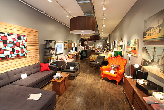
One of the best surprises was finally stumbling upon Bobby Berk Home, and the amazing Bobby Berk himself. Bobby Berk Home was a long time advertiser on Grassrootsmodern, but it's surprising how easy it is to abstract a person or place which you have no personal relationship with. I've heard great things about him from fellow bloggers Capree and Jaime and I have been Facebook friends with Bobby for a while so I knew his face. When I saw his shop I popped my head in and asked if he was around. Unfortunately he wasn't. After looking around his fantastically curated store, I was heading out just as he was coming into the store. Thankfully I recognized his face and had a chance to introduce myself and my girlfriend to him. I can now confirm that all the rumors are true. He's an amazingly nice guy, and has a great shop. If you ever find yourself around any of his 4 stores, make sure you stop and take a look. If you are in SoHo, don't be shy, ask if he's around. Oh, and of course you can check out his stores website (20% off Gus Modern this week!)

Thanks Bobby! It was great meeting you finally. 

Photo by Donny Tsang - New York Times.

Cube Side Table

NewImage

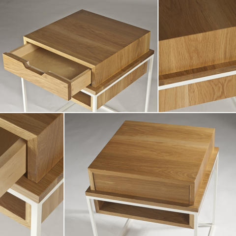
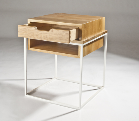
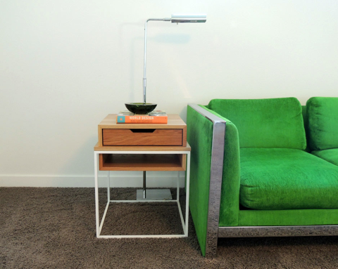
A huge congratulations to my friend and fellow blogger Tyler Goodro of Plastolux on his latest collaboration with Eastvold! It's great to see someone make the transition from talking about good design to producing good design. The Cube Side Table was designed by Tyler and made by Eastvold and is right on trend with one of my latest obsessions, wood and steel. He even has a walnut and brass version coming out soon that is going to be amazing. 

Cube Side Table

NewImageNewImage

Analog Modern

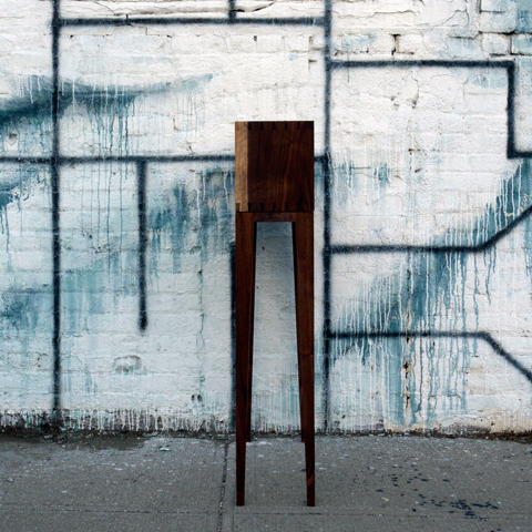
NewImageI'm always thinking about good names for a website and/or business. The other day I was thinking about how much I like clean modern design but with age old hand made details. The name "Analogue Modern" popped into my head, and I was almost giddy to find out that the domain was still available. Seconds away from snatching it up, I started to wonder. Did I spell "Analogue" right? Yes and no. There are two spellings, and it looks like "Analog Modern" doesn't just exist, they are doing exactly what I had in mind. Despite the disappointment that someone got to the idea before I did, I'm mostly just excited to find another great indy shop putting out good furniture. 
Analog Modern

NewImage

NewImage

NewImage

Green Design : Evo Conf 12

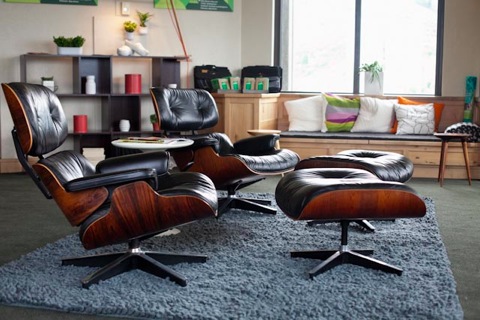
Evo Conf 12 ebaySo yesterday I had a chance to get back up to the Canyons to take some better pictures of the suite. The picture above is probably my favorite of the bunch. It's always great when you get to put two Eames Lounge chairs in a space. The Cush rug from BluDot is pretty great too.

Photo 1

Photo 2

Doing the design in the suite I had two big challenges. First to make it not look like just another Park City rustic hotel room. This was actually pretty hard to do. Above are two pictures that show what the space looked like when we started. The top one is from the exact same view as the first Eames Lounge picture. Which do you like better?

To start we did a lot of taking things out. All of the furniture was removed from the room as were the cushions on the built in benches. Curtains were taken down, doors were removed etc. We even took down some light fixtures. Stripping everything out made the space so much better. There was still a lot of rustic feeling in the form of knotty pine woodwork that I could get rid of, but I had a plan for that. Now I just had to fill the space up with something that looked good. That brings us to the second problem.

Everything I put in the room had to be eco conscious. Everything. Ebay has a little primer for buying green that became my mantra.

#1 Buy Pre Owned - The greenest product is the one that already exists. 

#2 Resource Saving - Do more with less.

#3 Sustainable - Materials Matter

Luckily I had some good guidance in this area from Zem of Ecofabulous. I generally think of myself as an eco aware guy but it's absolutely amazing how much more she knew about everything green. It was very educational for sure.  

So without delay, here is the rest of the suite, and what went into it.


NewImage

NewImage

NewImage

Entering into the suite there was a big ugly closet that greeted everyone. I took care of it by covering it with a large white board and some Urbio containers full of succulents. Not only did Urbio just win best accessory at Dwell on Design, it's also made of recycled plastic (#3). To top it off Beau, one of the designers, is an incredibly nice guy.


NewImage

Also in the front entryway was a little niche that needed to be filled up. I used a Way Basics shelf here (and in several other places in the suite) because it's super affordable and made of 99% recycled material (#3). I filled it up with items I found at local thrift stores (#1).

NewImage

Around the corner there is a short hall that looks into the kitchenette which is just off the main room. It's not the best looking kitchen so I gave it a little shield with a GORGEOUS rosewood Eames screen (#1) and a flower arrangement.

NewImage

The main room is dominated by two vintage Eames Lounge chairs (#1) a small tulip style side table (#1) sitting on a wool Cush rug by BluDot (#3).


NewImage

The wood benches needed some sort of padding on them because we removed the horrible looking pads there were on them. I covered two of them with 1" thick felt  (#3) held in place with a rug pad. The felt is actually made of wool and recycled synthetic content (like recycled bottles). Pillows are fantastically eco friendly and come from Inhabit (#3). 

NewImage

The other two benches were covered with wool Flokati rugs (#3) held in place by a rug pad. Lots more pillows from Inhabit (#3) too.

NewImage

Also in the main room were two Way Basics shelves side by side that I filled up with vintage pieces (#1) and succulents. 

NewImage

My favorite part of the shelf unit is a fantastic pair of white wooden clogs (#1) lit from above by the  Pablo Clamp Lamp (#2)(#3).

NewImage

Speaking of lamps, I didn't get a good photo of it, but the Moooi Miyake table lamp (#2)(#3) is pretty fantastic as well although I do wish it put out a bit more light.


NewImage

Photo

Perhaps my favorite piece in the room were the 6 Coventry Stools by Studio Dunn (#3). The are a nice little bit of eye candy for the room and they provide flexible seating or a convenient place to set a drink. Also a huge thank you goes out to the guys from Studio Dunn who built these 6 stools and shipped them to Utah with just a week or two of heads up. 

Photo

NewImage

The last seating area is the dining table built in bench. Unfortunately I couldn't remove those cushions, but I was surprised that they didn't look as horrible as I thought they would. In front of the bench is a vintage Brown Saltman coffee table by John Keal (#1) lit from above by a Claudo pendant by Cerno (#2). The wall behind the bench was covered with raw Wall Tiles by Inabit (#3).

NewImage

There were two good outdoor patios that I filled up with vintage Bertoia chairs (#1) a vintage teak bar cart (#1) Emeco 111 Navy chairs (#3) and Tom Dixon Offcut stool (#3).

NewImage

NewImage

NewImage

NewImage

Last but certainly not least was the green fashion room. I designed three literal Pinterest pin boards for attendees to use. The idea is they pick out outfits from the clothes in the room, pin them to the board, and share them on Pinterest. The person with the outfit that gets the most pins wins and iPad. You should be able to see all the outfits by looking for the ebaygreenstyled hashtag on Pinterest. 

Also in the room is the reclaimed clothes rack I designed. A few people have asked for more info on it, and I'll give a better DIY on how to make your own next week. 

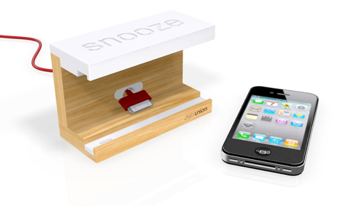
Snooze

NewImage

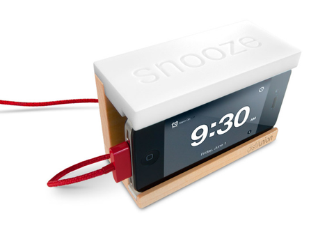
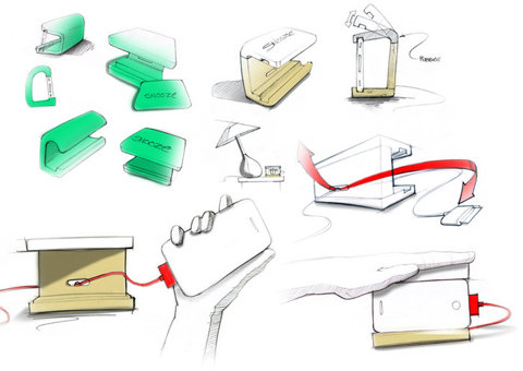
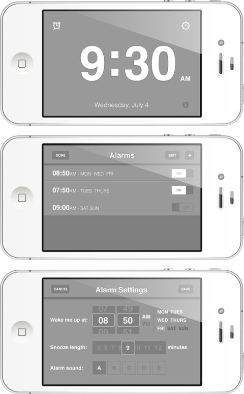
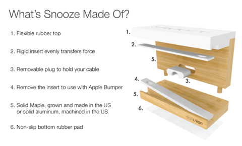
Every night I sleep with an iHome next to my bed. I think it has an alarm function, but honestly I can't tell you for sure because I've never used it. In fact for some reason I don't even dock my iPhone on it, I just use the charging cable that comes with it. I also use my iPhone for an alarm every day, and while I've gotten pretty good at hitting the snooze "button" on the screen with one sleepy eye open I admit a big physical button would be easier.  Enter Snooze. It is a convenient docking station for your iPhone, and perhaps more importantly it turns the whole top of the dock into a giant snooze button. It comes with a free alarm app that makes your volume button a snooze, and has other expanded options. It's on Kickstarter for another 16 days and is currently half funded. It you like it, support it.

Snooze on Kickstarter $40

NewImageNewImageNewImageNewImage

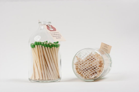
Reclaimed Apothecary Matchstick Bottle

NewImageI love these reclaimed apothecary matchstick bottles. In fact I love them so much I borrowed the idea (actually my gf did) for our bathroom. Our bottle is a little different, but the idea is the same.  The one thing ours doesn't have is the etched glass for striking the matches. I know you can buy glass etching stuff at craft stores, but I wondered if anyone has tried it, and how well it's worked?

For the non crafty, get your reclaimed apothecary matchstick bottle on Etsy for $20

Carlo Mollino :: Reale Table

NewImage

A few days ago I was at an open house for a local MCM Furniture store called The Green Ant. They've been around for years, but just recently expanded the store (congrats Ron!) and now have an entire half dedicated to more high end design. Sitting in the middle of the space was this Reale table from Zanotta. I loved the look of it, but I was a little confused as to why it was in the space, as it looked to be a new design and not truly mid century. You can imagine my surprise to find out that it was really designed in 1946 by Carlo Mollino. It's a pleasant feeling to continue to be surprised at just how timeless good design can be.

Reale Table 

Carlo Mollino

The Green Ant

More pics from Zanotta's website


NewImage

NewImage

NewImage

NewImage

NewImage

Nest Thermostat

NewImageI finally broke down and bought a Nest thermostat a few days ago. I can honestly say that it's the first time in a long time that my expectations have been exceeded across the board with a new purchase. That's not to say that I had low expectations either. I had seen the Nest in friends homes, and I knew it was good looking. I wasn't expecting it to be so well thought out from beginning to end though. First off I ordered it from Apple.com and received it like 2 days later. Next came the installation which was super easy, the thing even comes with it's own multi tip screw driver. Setup continued to be a cinch, getting it connected to my wireless network and controlling it from my phone took all of 10 minutes to do. I honestly don't have anything bad to say about it at all. 

Who else has a Nest? What's your favorite thing about it?

Nest

Misewell

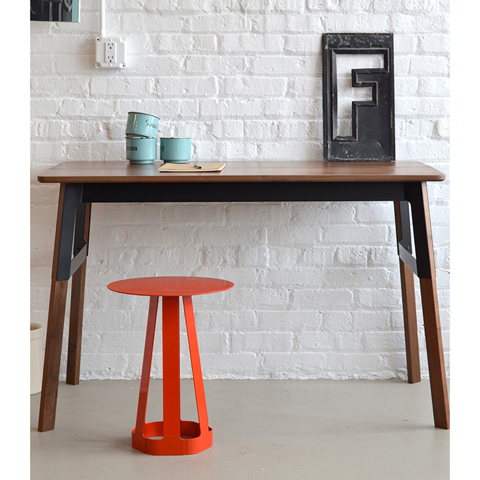
NewImageIt's no secret that I'm a fan of steel and wood coming together to make beautiful furniture. It is surprising however that I have only mentioned Misewell before in passing lately, because they do wood and steel so well. The new Grain desk shown above is a perfect example of that. Solid walnut and black steel have never looked so good.
Misewell Grain desk

Frank

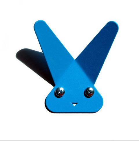
NewImageTired of drunk octopuses wanting to fight with you? Meet Frank. Available in a variety of great colors, he would be more than happy to let you hang your coat on him. Charming, affordable, practical. That's my kind of rabbit. 

Frank $10

NewImage