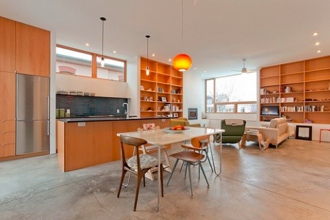
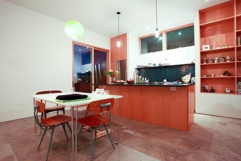
 Last week I gave you a little peek of the completed House 2 project, and many of you were asking for more interior shots. I've pulled a couple off of the Modern Union Flickr page, and added a few off of my Flickr page as well. As is typical, the photos really don't do the space justice. The thing I'm most impressed with is how the house feels, not looks. The proportions are just so nice. All the VG fir woodwork by Modern Union really does a lot to warm the space up too. White walls and concrete floors can sometimes come across cold and sterile, but all the woodwork really makes the whole house feel very warm.
Builder Mark Haslam did a fantastic job with the entire project. I need to get over there and get some more photo's of the exterior too. The whole thing just turned out so nice.
See the whole House 2 project.
Lots more photo's after the jump.
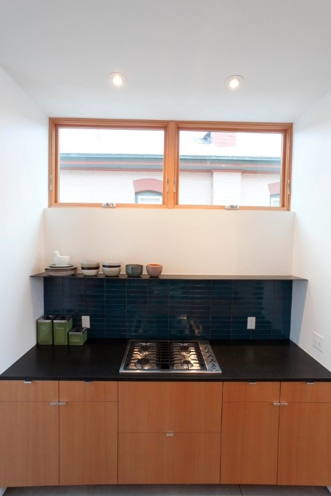 Photo by Modern Union
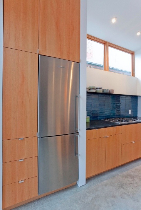 Photo by Modern Union
I took the following photo's a while ago, before everything was totally finished.
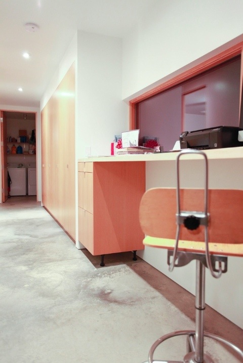 Hallway with built in storage and desk niche.
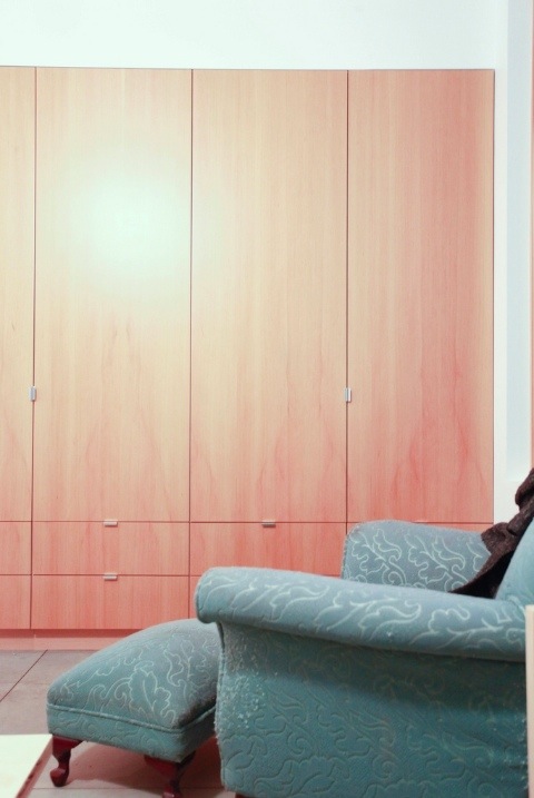 Master bedroom. I love how the 12' run of cabinetry has no fillers. Perfect fit.
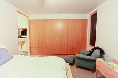 Master bedroom. Looking the other direction is a full wall of glass with two big sliding glass doors.
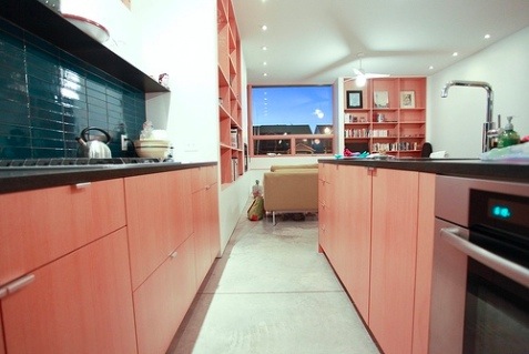 Kitchen looking towards the front of the house.
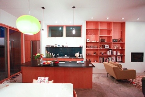 Kitchen with dining table in foreground.
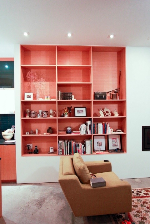 This bookcase is 8' x 8'. That should give you a bit of an idea of the scale of the room. 10' ceilings feel perfect for the space.
