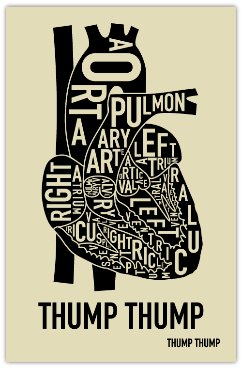
You may remember those sweet neighborhood screen prints from Ork Posters we wrote about a while ago. Looks like they're branching out from the city-theme and trying something a little more scientific. The Heart print features the same bold use of typography but instead of well-known neighborhoods, identifies all the parts of the heart. I hope they take this new anatomy theme and run with it - could be a very cool series!
