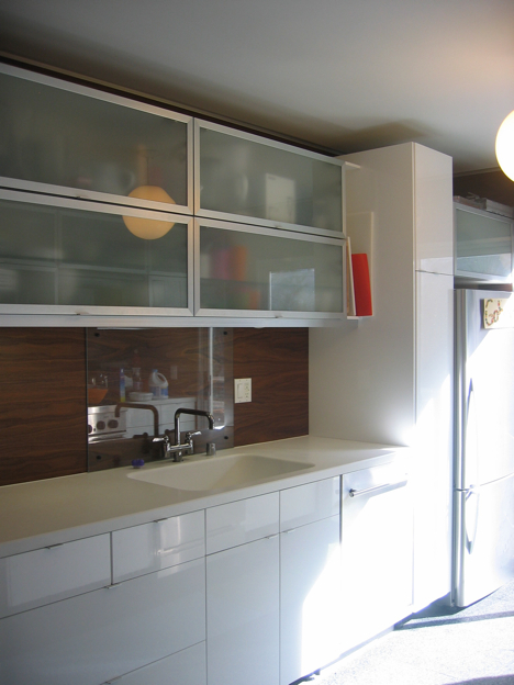
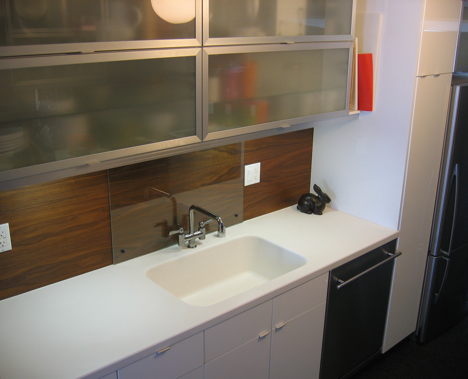
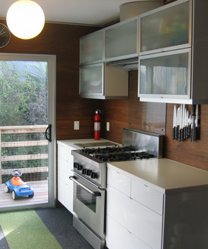
 Brandon did a beautiful job on his kitchen redo. Replacing a bunch of the drywall really helped to warm the space up and gives a nice contrast to the stark white of the ABSTRAKT and Corian kitchen.
Our kitchen design is the result of three principles:
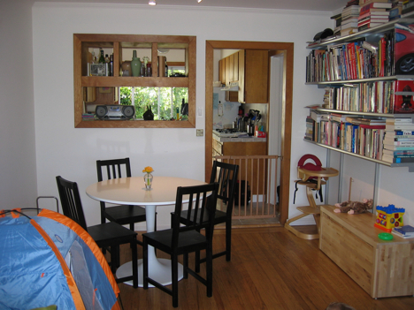
1. Maximum sight lines. In our small home (860 sf), opening things up so that adjacent rooms "lend" their space to the room I'm in makes me feel less confined. By removing the wall between our dining area and kitchen, we can now see from the front of the house to the back.
2. Hatred of drywall. Yes, it's kind of irrational, but I really dislike drywall. Using walnut veneer plywood for the walls in the kitchen allowed me to keep the drywall out of the kitchen, while providing some essential warmth to the white-and-metals palette we'd chosen. Another benefit was that having plywood walls allowed me to mount the cabinets to the wall without requiring blocking between the studs or using anchors.
3. Compromise. My wife's aesthetic is not as adventurous as mine, so the kitchen is neither as out there as it might have been if left to me, but it was still led more by form than by function. It does function well, however.
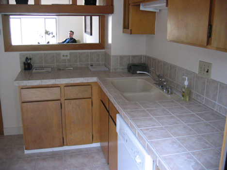
I did everything in the renovation except the electrical and any plumbing that required solder. There was absolutely nothing worth salvaging in the old kitchen, so I gutted the room—subfloor, studs, and joists. The old sliding door leaked, so I reframed the opening, replaced the damaged section of the subfloor, and installed a new door. We also removed the old, disused terra cotta flue that took up about 2 square feet in the corner.
The cabinets are Ikea; Abstrakt white for the base cabinets and Avsikt for the uppers. Appliances are a Fisher & Paykel refrigerator (truly cabinet depth and relatively narrow, it was the linchpin of the layout); Thermador 30" range (from our old house); and Asko dishwasher (also from the old house). We used Home Depot for the Corian counters with an integrated sink. Behind the sink and range, we installed sheets of tempered glass as backsplashes that would not obscure the walnut.
We chose Flor polypropylene carpet tiles as an experiment, partially because of budget. They've held up well, but I think we'll eventually put in oak strip flooring to match the rest of the house. If we do, I will miss the color pop they give.
A detail that I'm proud of is the 1-inch reveal where the wall meets the ceiling. Instead of soffits or running the upper cabinets to the ceiling, I held them back to give a sense of openness. The reveal is created by an aluminum extrusion from Fry Reglet. It also captures the top of the plywood so that I didn't need to have a finished edge.
The renovation took months, mainly because I didn't make all of my design and materials decisions before the sledge hammer first flew. I'm now in the midst of renovating my bathroom, and even with the decisions made ahead of time, it's still slow going. I guess it must be me!
Approx Cost: $7,000
Before
After
